-
3 Common Accessibility Issues on eCommerce

In the competitive digital landscape of eCommerce, ensuring accessibility for all users is critical for not losing sales. With the increasing reliance on online shopping […]
-
Four things to know when getting an accessibility audit

Web accessibility is a growing concern for many site owners and managers. It’s an increasingly common practice to get an accessibility audit that tests your […]
-
No Website is ever 100% accessible (and what that means for your site)
If 100% accessible means that 100% of the people who come to the site will be able to use it without barriers regardless of their […]
-
Monthly Accessibility Maintenance for eCommerce
Ecommerce websites typically change a lot. Products are added and removed. Prices are changed. Images and product descriptions are updated. New features are added. Because […]
-
Will the 2025 European Accessibility Act Apply to your Site?

In June 2025, new accessibility regulations in Europe begin to be enforced. And like GDPR, website owners in other nations may need to bring their […]
-
6 Reasons Why Accessibility is Maintained, Not Attained
Some automated accessibility plugins describe accessibility as a “once and done” sort of thing and that is not so subtly affecting the way site owners […]
-
Worried about a web accessibility lawsuit? Here’s what to do

It’s true that you can get sued or fined over the accessibility of your website. If you are concerned about your risk, this post offers […]
-
AccessiCart CEO Bet Hannon on Ecommerce Marketing with the Pitbulls

AccessiCart CEO Bet Hannon appeared on the April 27, 2023 episode of Ecommerce Marketing with the Pitbulls. From the show notes:In this episode of Ecommerce […]
-
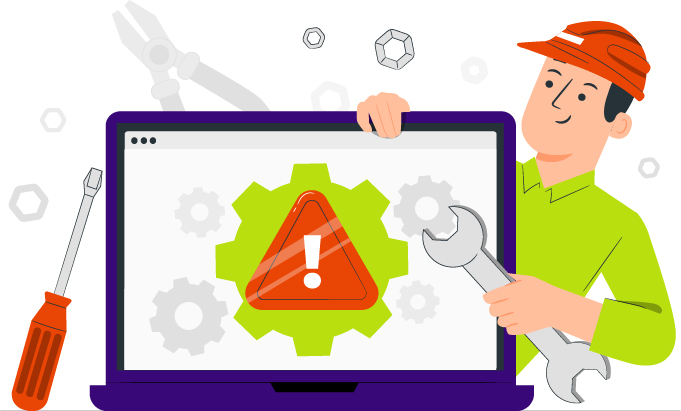
The Importance of Manual Human Testing for Accessibility
When you need to test your website for accessibility, you might be choosing between multiple experts who will perform an audit, or be using online […]
-
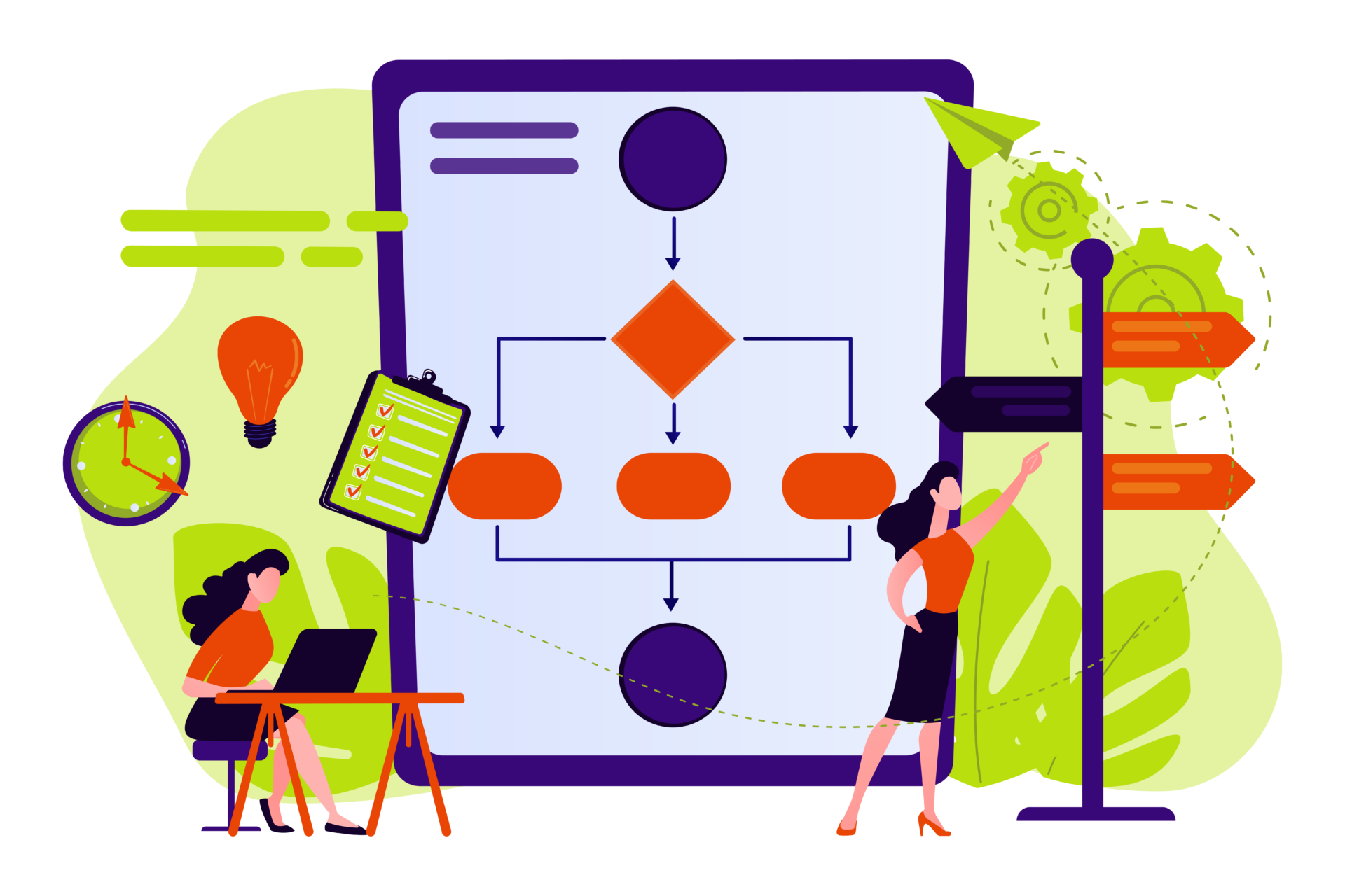
Creating a plan for accessibility improvements and maintenance

An audit is just the first step. You need to have a plan or roadmap to guide your team toward fixing, improving and maintaining website […]
-
How to write effective product alt text for accessibility

Generally, the purpose of alt text is to provide the same context to someone who is visually impaired as it would to someone who can […]
-
2023 design trends from an accessibility perspective

Another year, another aggressively different design landscape to keep up with. Well, maybe not so much this year. The design trend projections for 2023 can […]